This quarter I've been taking two painting classes only, when I'm a full MFA photography major. I have been so looking forward to really challenge my long-time hidden part of artistic expression beyond realistic photography work. Of course I still take photos, every week, but I knew being in school is the most valuable, meaningful invest I could make in my life. Since I only had about a year or two left in school, I wanted to take advantage of my prestigious art school curriculum in painting.
I originally started with just figures, no photography at all- but I received many feedbacks of them finding more vitality in my works of mixed media incorporating photography. Constantly praying and searching for new inspirations, one day after feedback from my professor I realized that was God's guidance and decided to really push photography in my paintings.
Above two are in that middle stage of really centering my photography but wanting painting to dominate my works. In these two I only used photography in terms of background creating, as one of the artists my professor introduced used photography in his painting so intricately. I thought including some inspiration artist I got recommended would be nice to share and document:
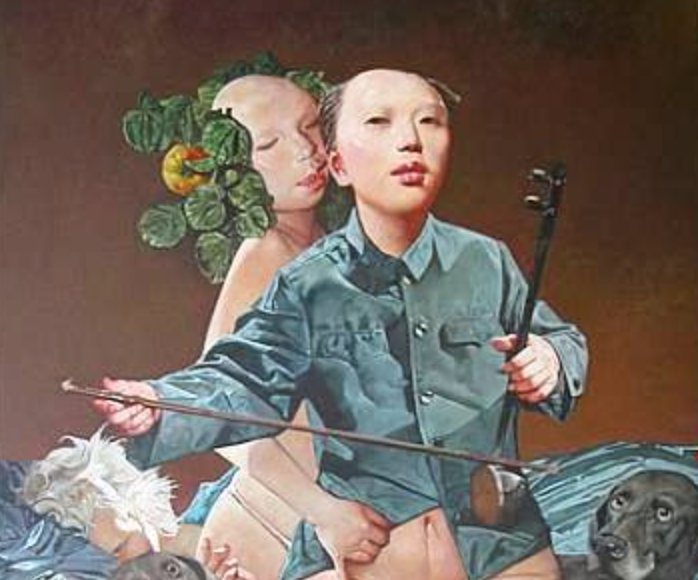
Left is Alan Feltus and right is Wei dong; Feltus' muted, textured, calm figures were fitting to the overall imagery of figures I always look for, but not intentionally that realistic. Wei Dong's content is not personally welcoming as it seems to have sexualization of women but as he creates the shirt in photography and the left decorative fruits, he perfectly aligns painting and photography together.
I am not crazy about the figure, and it's interesting because I sometimes have that edgy, strongly outlined features often nowadays. Personally it's different from how I see people but I think it's relatable to how I put the first layer down so dark. The floral decorations were inspired by my these days favorite- Kristin Vestgard, I still try to find my own decorative, feminine elements to add to my figures but not found something yet. During critique I had great compliment of created landscape behind the figure, to really pull that out in front. It was an honor that it was reminded of Monet's Haystack. Surprisingly, I had been reading about Monet and of course, I loved those series. Haystack series were drawn right after Monet's fame that he had in his late age, and the painting was sold even before he had finished painting. It's funny since then I try to create that mountain-like shapes with my photographs, but can't do it! It's always that natural, spontaneous stance when amazing figures are produced.
This was actually the first piece before the above one, and now as I see Monet's Haystacks on top of this painting, I am surprised how the color scheme is so similar; yes, I did love reading Monet's work. It's funny because I read it in my Kindle which the pictures were all black and white, but I guess I seemed to just know what the colors were looking like. Can't wait to visit Giverny this summer..


